Craft Meets Code: Upgrading the JioCinema Carousel
Discoverability is the life-blood of a content platform. To that end, the JioCinema design team was tasked with upgrading our carousel element on our homepage. It was important to showcase the breadth and richness of our catalog to our customers for their consumption — "showcase" being the operative word. While there are several examples in the entertainment world, we wanted to ensure that we designed for our long term value unlock and the vision of the platform.
Two things remain irretrievable — time, and a first impression.
— Cynthia Ozick
The carousel. When you open the app, it’s the first card you see. The first content you consume. Maybe, the first, "delight you", experience.
The status quo
Let's start at the beginning. In early 2023, the carousel needed a lot of work to showcase our content in all its visual glory.
Re-design goals
We wanted to design an experience where you can...
- See what’s new or relevant to you
- Sample content with minimum effort
Our design goals:
- We wanted the carousel to take advantage of the phone’s default portrait orientation
- We wanted the UI to seamlessly blend with the content
- We wanted to de-couple posters and logos
- Whatever we designed needed to work smoothly and feel fun to use
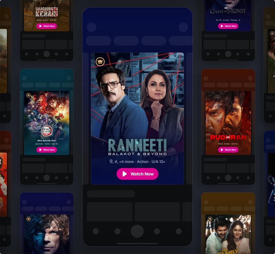
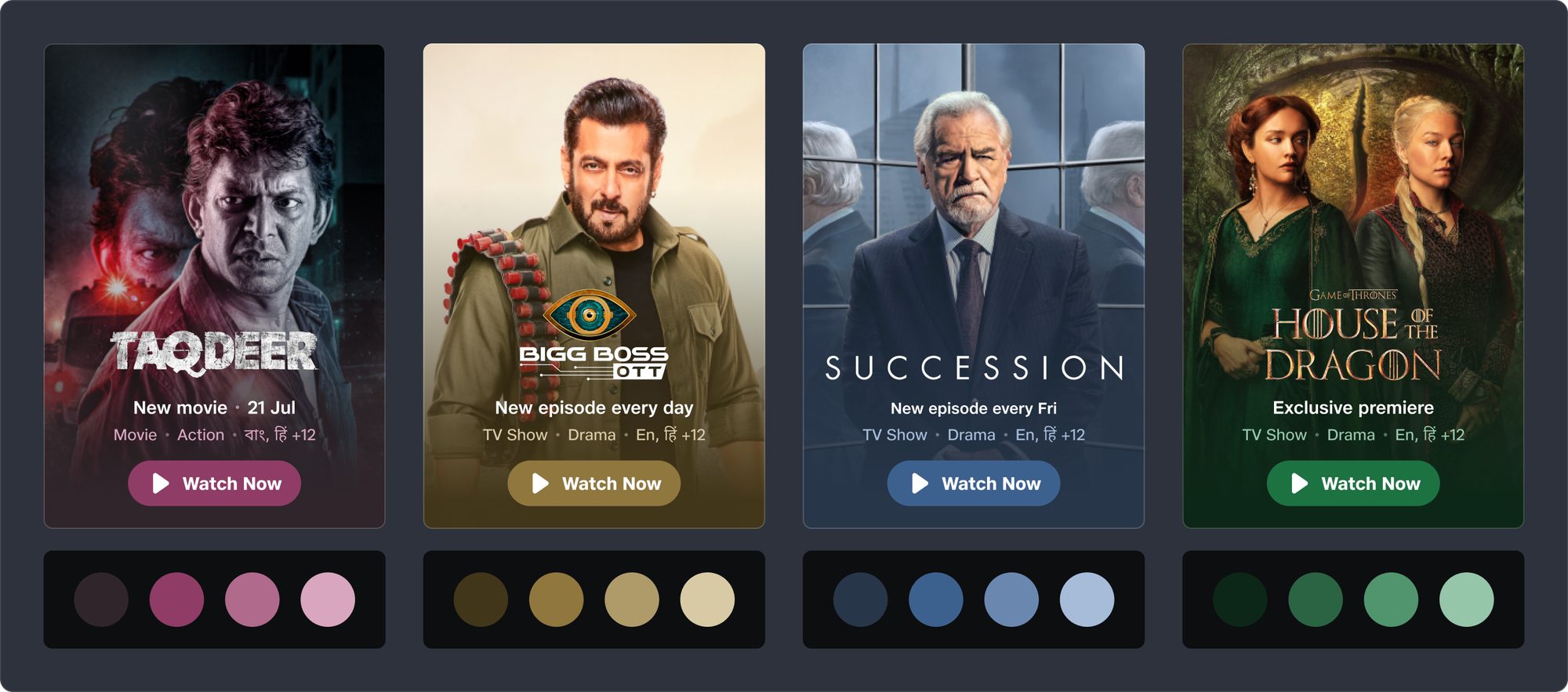
Visual design
Visually balanced logos
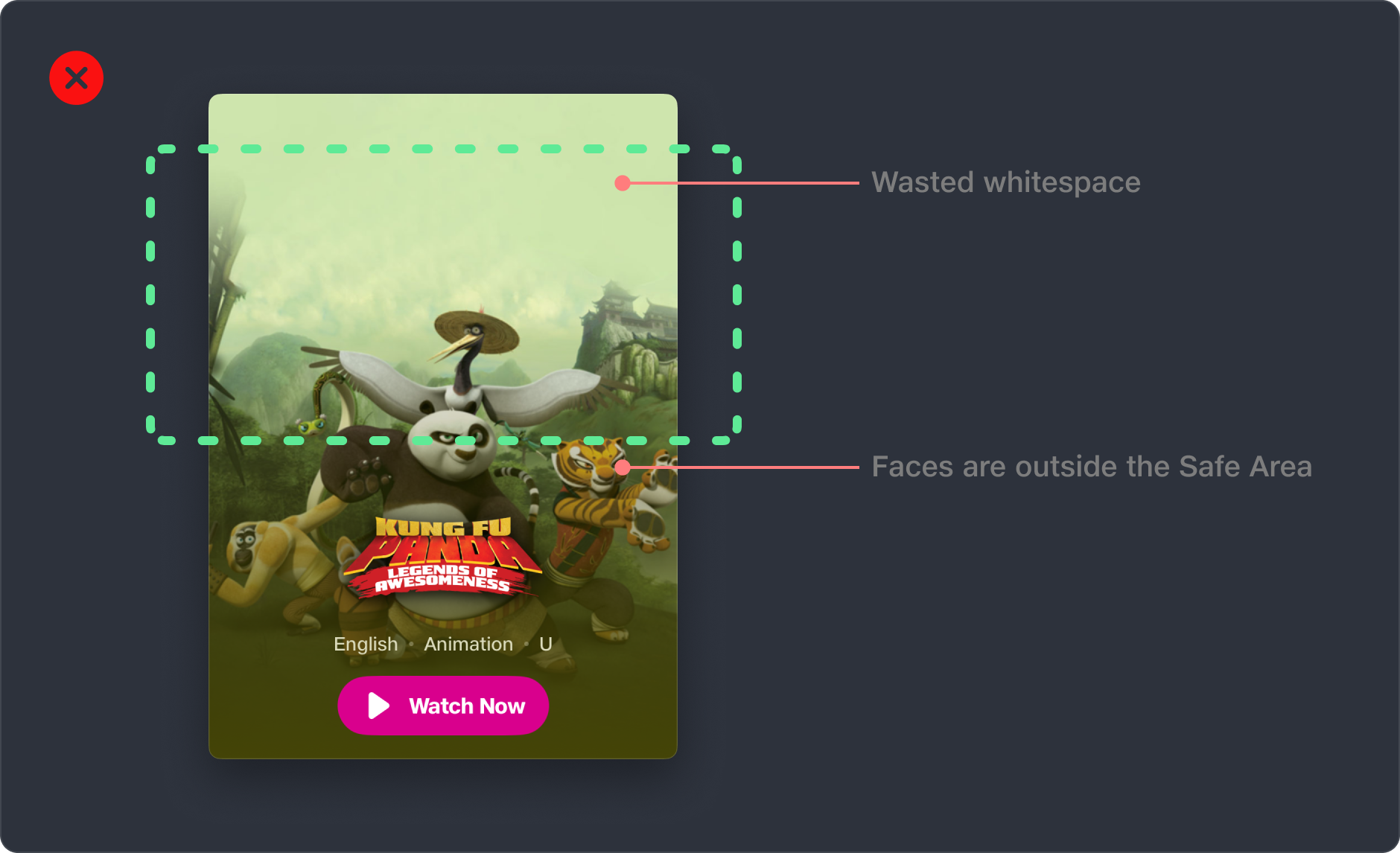
To make the design work, posters and logos needed to be de-coupled to provide presentation flexibility. The carousel is a great place to start this process on a select few titles. Eventually, every title on the platform would need this treatment.
But we faced a new challenge.
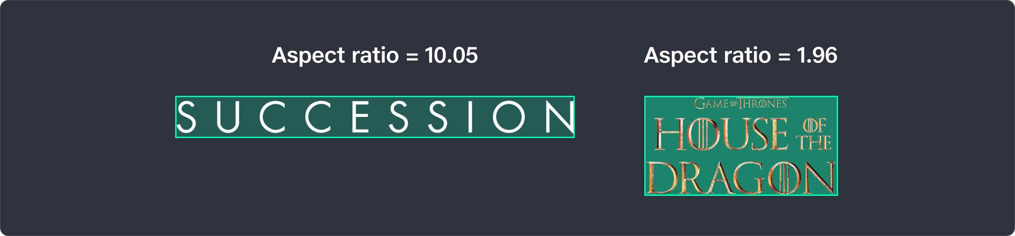
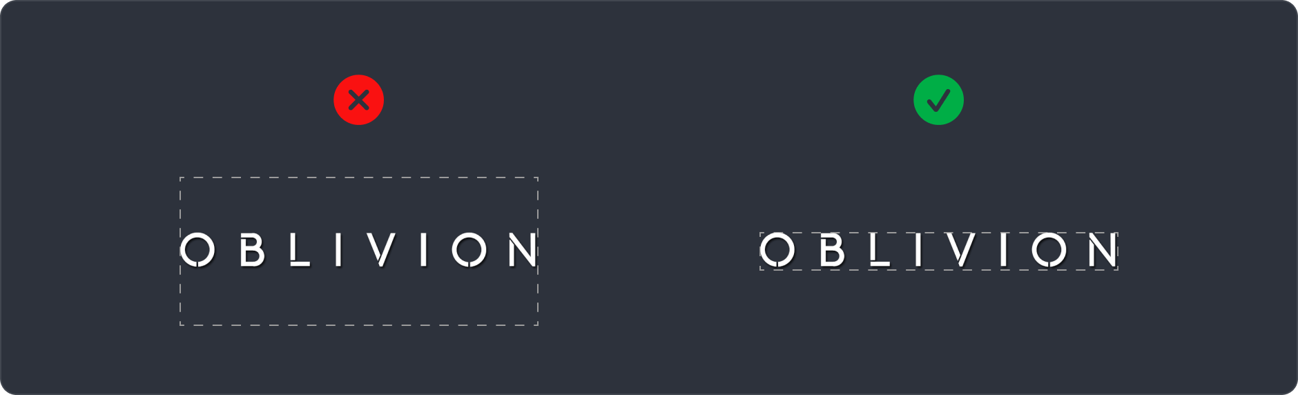
Logos come in diverse aspect ratios - some wide, some square-like, and some tall. We needed a scalable way to visually balance logos. It wasn’t enough to assign a common height or width.

Here’s what happens when a wide logo is assigned the same height as a taller logo:

To achieve balance, the wide logo should be less tall than the taller logo. Hitting the sweet spot usually requires a human with a trained eye.
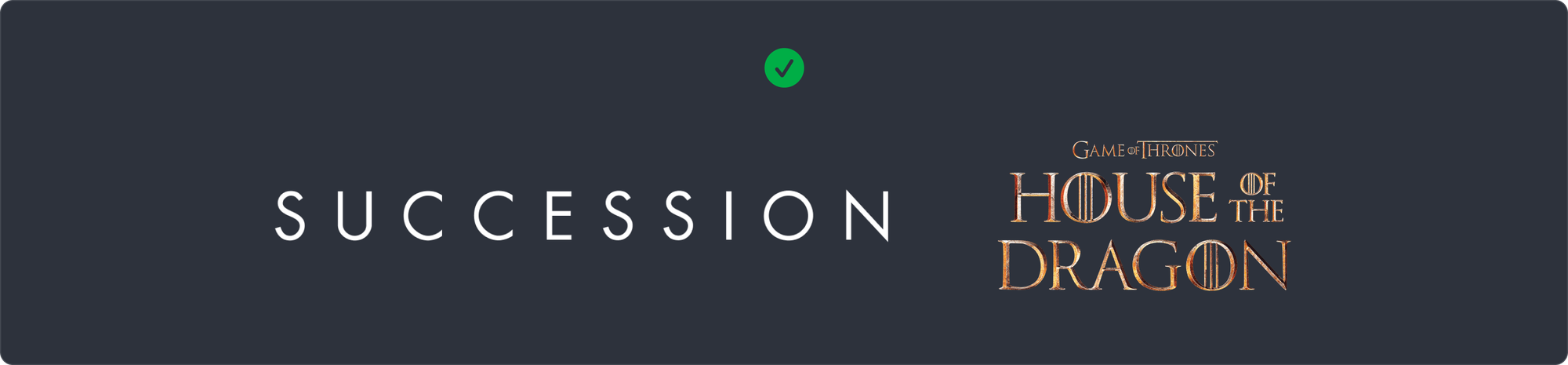
Because of the sheer volume of logo assets, we wanted a scalable solution that didn’t rely on humans.
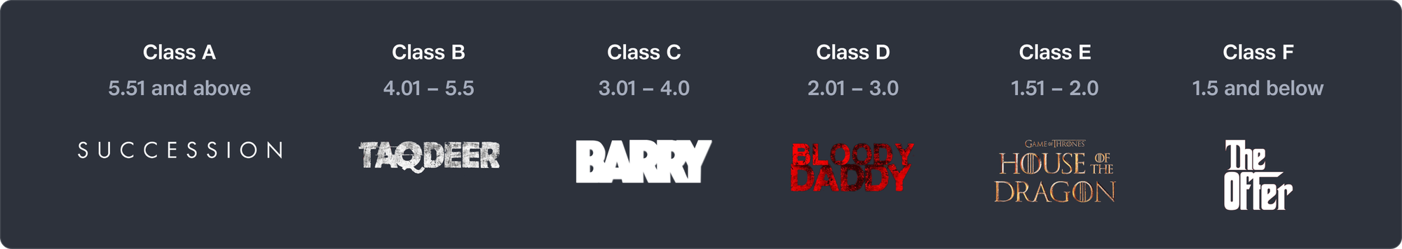
We devised a system of “logo classes” based on the aspect ratio of the logo (width ÷ height).
- The widest logos got Class A. Less wide ones got bumped to Class B, then Class C, till Class F - which had the tallest logos.
- Then, each logo class was assigned a height. Class A got the lowest height, and this kept increasing from Class A through F.
This allowed logos of diverse aspect ratios to appear visually balanced.
Logo class calculator
We initially relied on humans to manually assign a class for every logo. To help them out, we devised Logo Class Calculator (made entirely on Figma). Enter the logo asset’s width and height and it tells you the logo class, along with a preview.
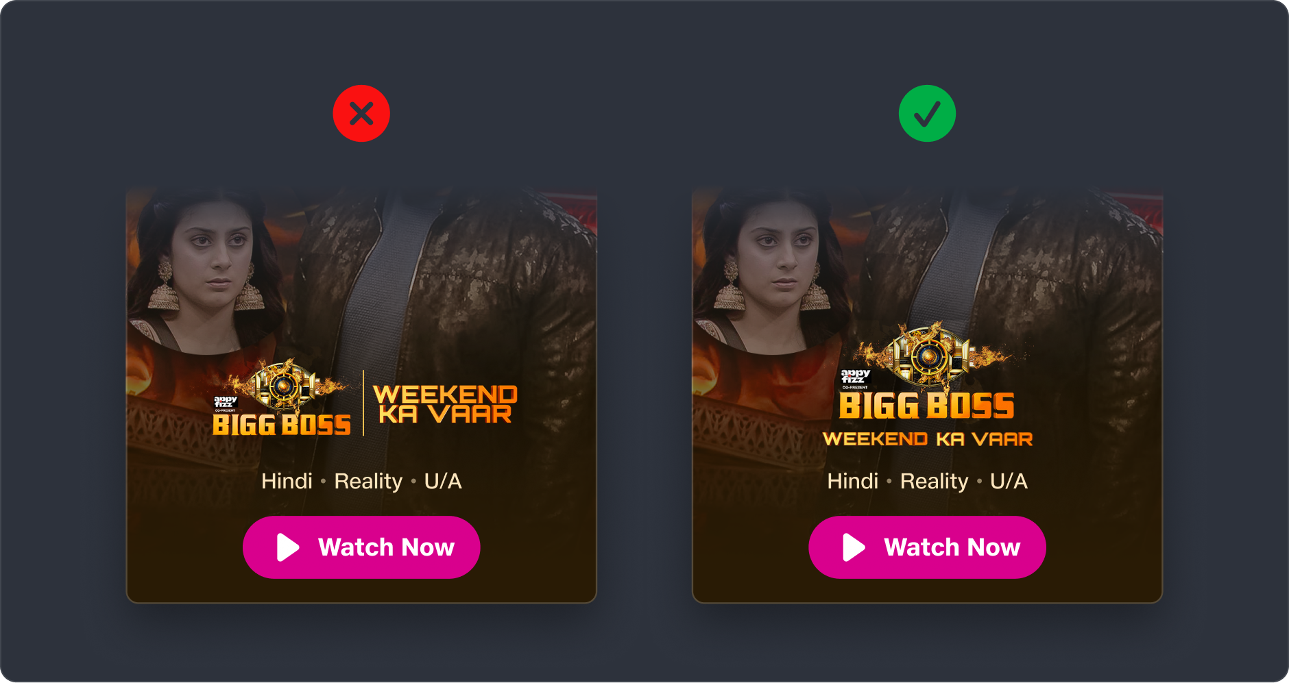
Visually pleasing compositions
Posters occupy a large placements on our platform. When we place any information on top of a poster, it needs contrast to be readable. The traditional method is to use a dark scrim or a dimming overlay.
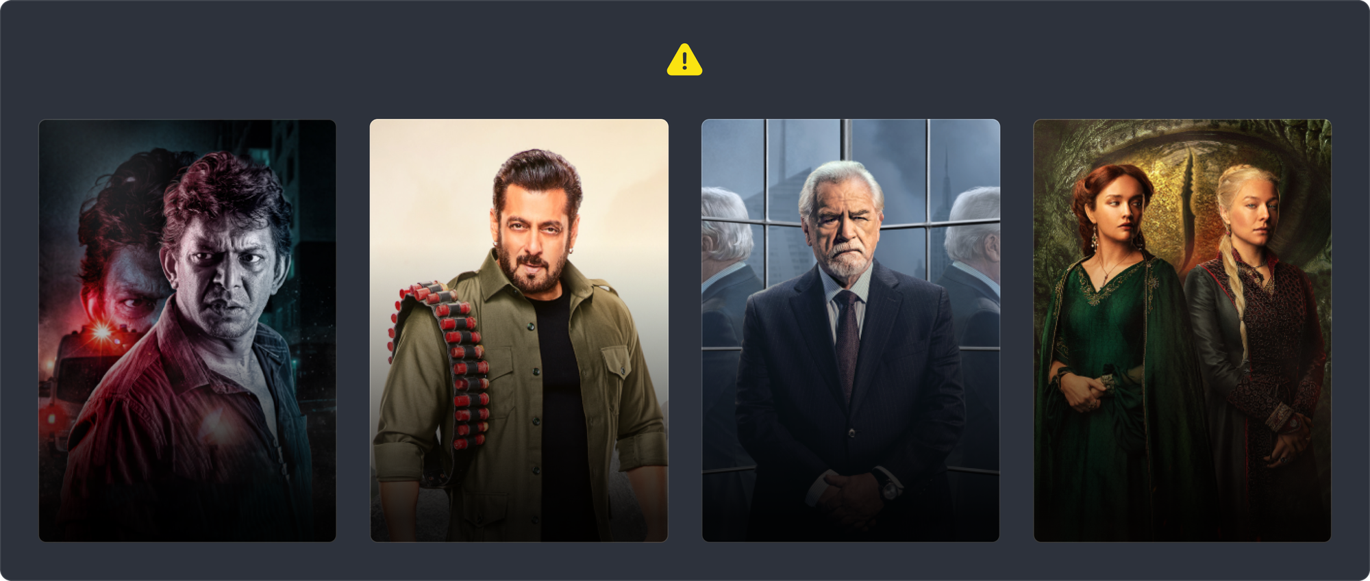
We don’t like that these downgrade the visual design by darkening parts of the poster.
Instead, we automatically pick the dominant colour of the poster, and use that as a scrim instead. This way, we also preserve the visual design by complementing its colour palette.
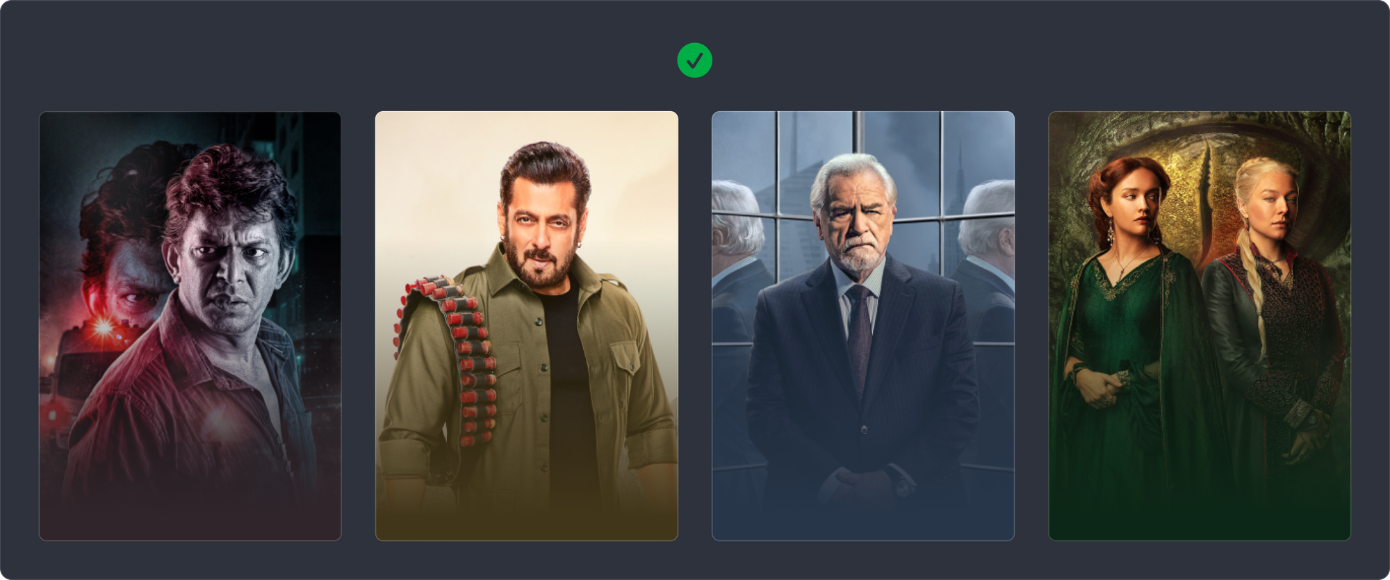
We went a step further and extracted four tones from every poster’s dominant colour - from light to dark. We used the lighter shades for the metadata text. This extends the colour palette to more UI elements.
Looking into the future, the four tones of colour generated for every poster will also find use in other features down the road.
Interaction design
Our goal was to get users to consume content with as little friction as possible. With this in mind, we explored a few interactions.
Exploration 1: Autoplaying cards
The most intuitive and conventional exploration — a series of paged cards that autoplay when left to idle for a short duration.
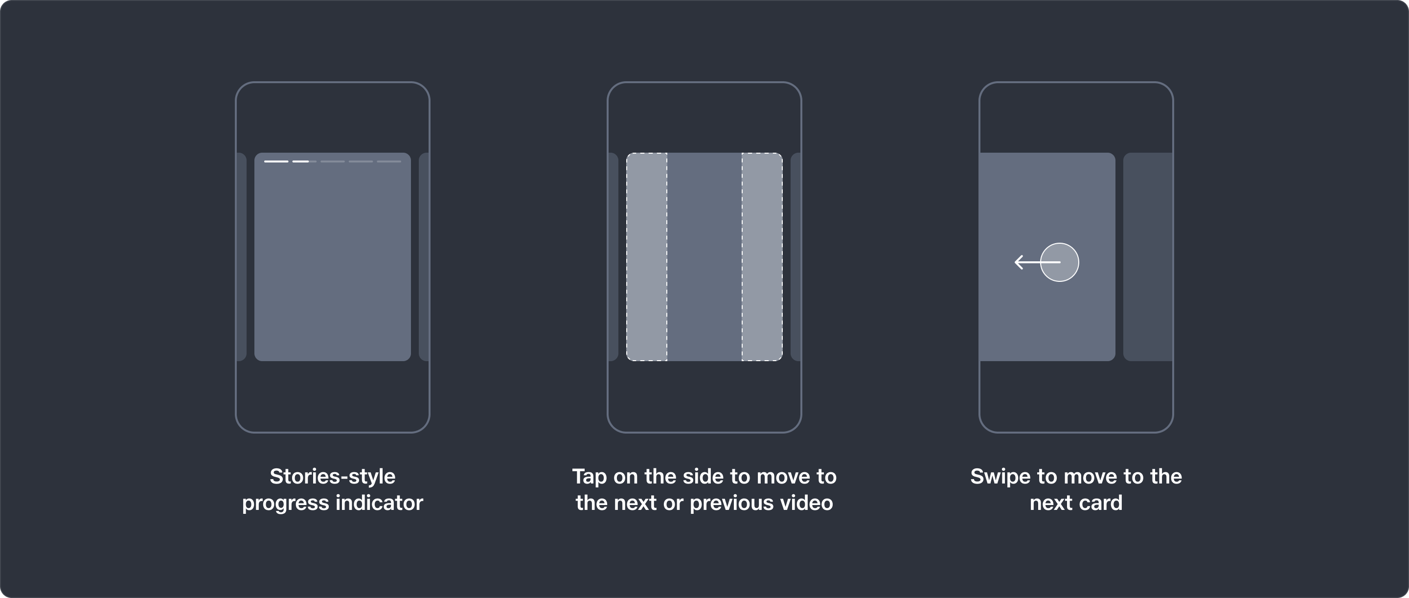
Exploration 2: Stories-style series
We drew inspiration from Stories as seen on Instagram and WhatsApp. The idea was to let users sample multiple short videos from a movie or TV show, which would pique their interest.
Videos would auto-next, letting users consume them with no friction at all.
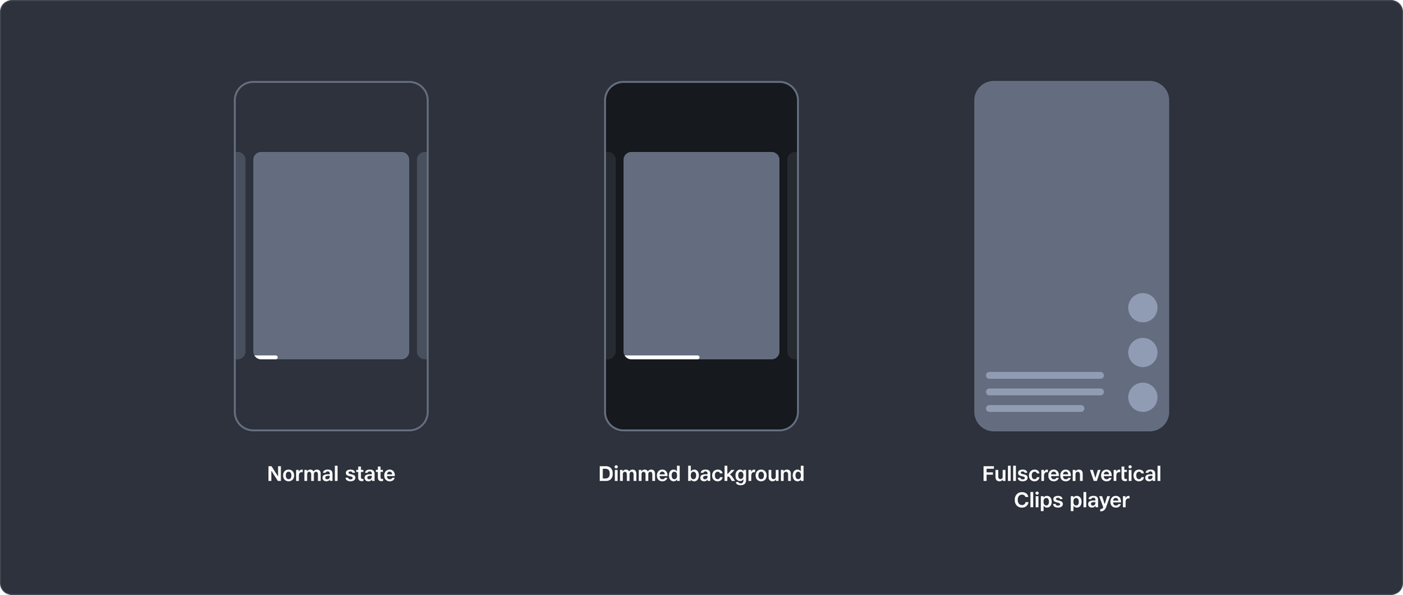
Exploration 3: Immersion into Clips
If the user watches the trailer beyond a threshold, we interpret that as a signal of positive engagement. We then take them to our vertical video format (Clips) where they can swipe to see other content. But before doing this, we telegraph this change by dimming the background. This also makes the content feel immersive.
Breaking down the parallax effect
A lot of effort was invested to get the parallax effect just right. We wanted a unique effect for the carousel - one that would elevate the experience of browsing content without distracting the user.
The parallax effect we used lets the user’s eye focus on the content by letting it stay “in place” as the user moves through the cards. The resulting effect feels like turning pages in a book, or moving through a deck of cards.
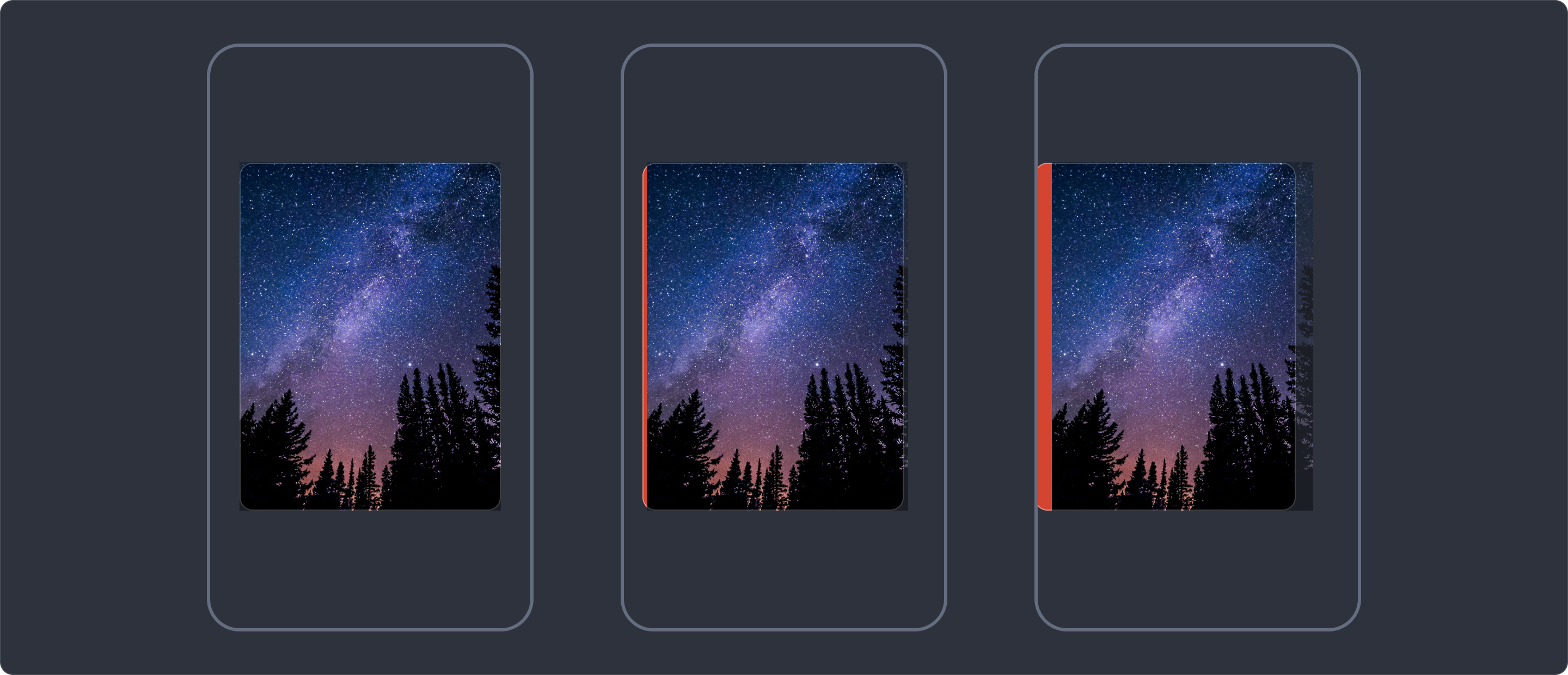
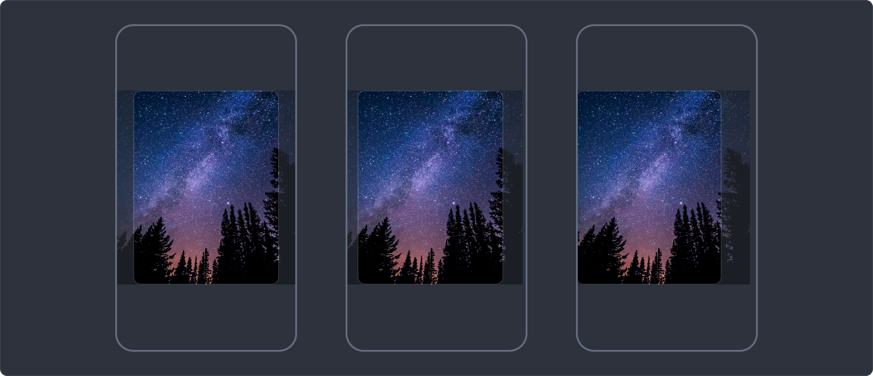
Solving the problem of content leaving the edge of the container
Because of the very nature of the content moving at a slower speed than the container, the content “separates” from the edge of the container. This creates a gap between the content and container.
Some solutions we explored:
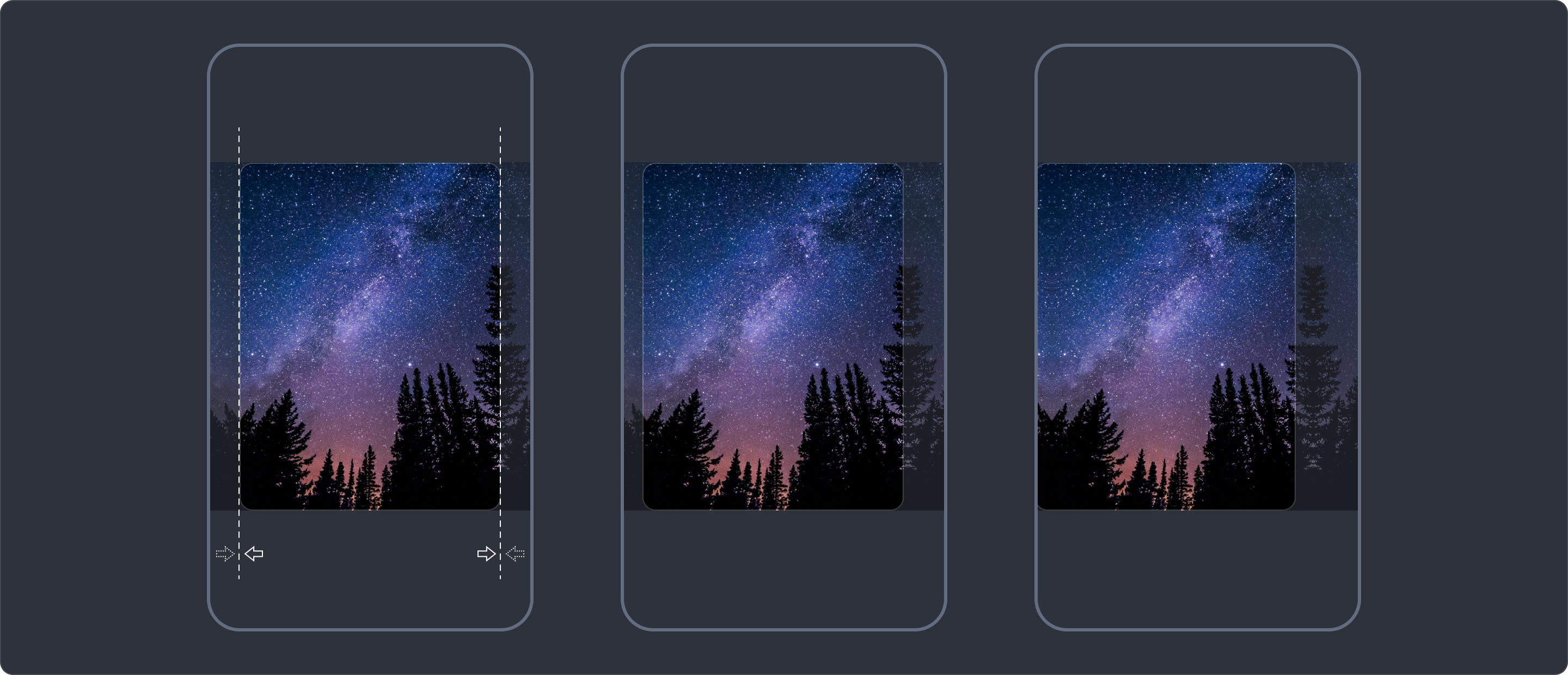
1 - Design the content to be wider than the container
If the content is designed to be wider than the container and is centre aligned within it, then as the container is swiped, the extra content is revealed around the edges.
However, the image size being different from the container size increases complexity in the design process. Given the number of teams that make assets for the carousel, the amount of communication overhead would result in more mistakes down the road.
2 - Mirror the content on either side
This is commonly seen on tvOS and other Apple platforms. Instead of requiring the content asset to be wider than the container, a wider asset is created by “extending” on either side of the image using a mirror image on both sides.
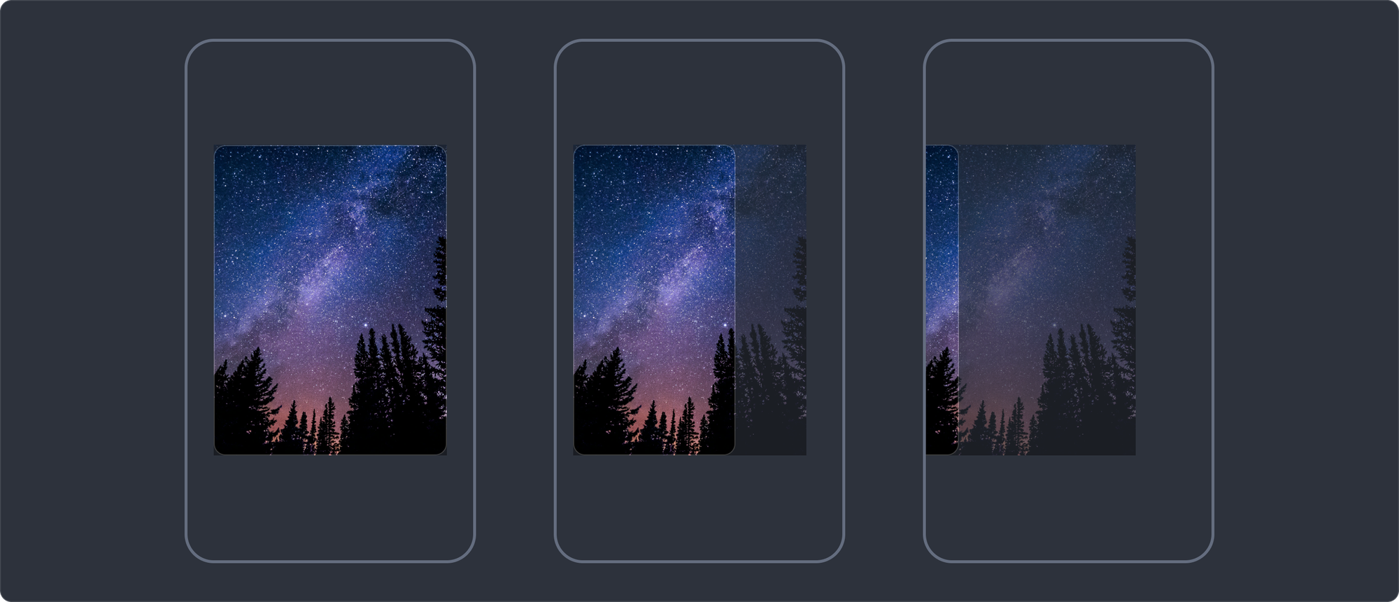
3 - Our solution
We took a different approach. We let the content stick to the edge of the container, while reducing the width of the container. This also achieved a “wipe” like effect in the final result. Here’s what it looks like:
Design detail: video progress bar
We’re proud of this little design detail.
In a conventional video player, the user must know about the progress of a video at all times, and must be allowed to seek through the video at will. But in a carousel video, the progress bar has a more focused purpose:
- At the start of the video, the progress bar does not have much value, and can be subdued
- But as the video approaches the end, the watcher must be notified before the card pages to the next
- Seeking through the video is not an affordance we want to design for
To solve this, we designed the progress bar to be dim at the start of a video, while letting its opacity increase as the video progresses.
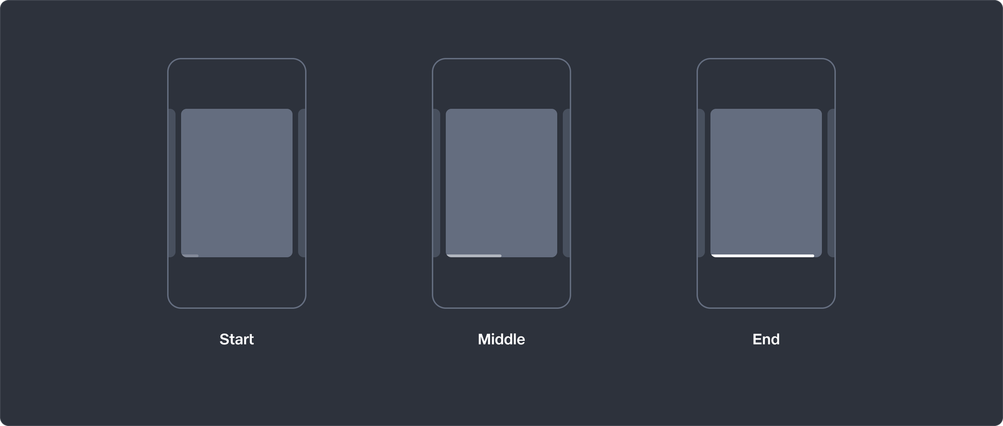
- At the start of the video, watchers won’t be distracted by its presence.
- As the video progresses, the progress bar increases in opacity, making its presence felt. The watcher will notice this and know that the video is ending soon.
This way, the progress bar exists only when relevant.
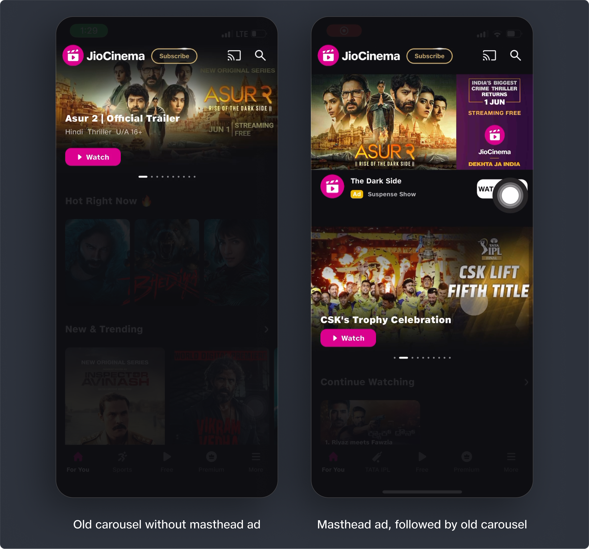
Masthead Ad
Ads are key to our monetisation strategy. It's easy to think of ads being at odds with UX goals, but it needn't be that way — they can coexist! We designed visual improvements to the masthead ad, and allowed the user to dismiss it easily if they've decided to move on from it.
Engineering handoff
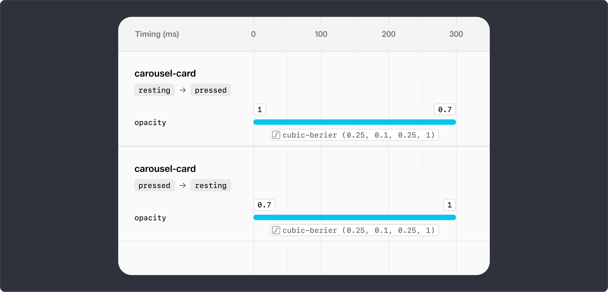
Want to befriend an engineer? Make great handoff documentation.
Architects and industrial designers don’t stop at concept sketches, so why should product designers? We need more than Figma to communicate our intent to engineers. We wrote extensive handoff documentation to help engineers implement everything down to the last pixel. And they knocked it out of the park.
To keep this article from getting much longer, here are just a few of the artefacts we created for them:
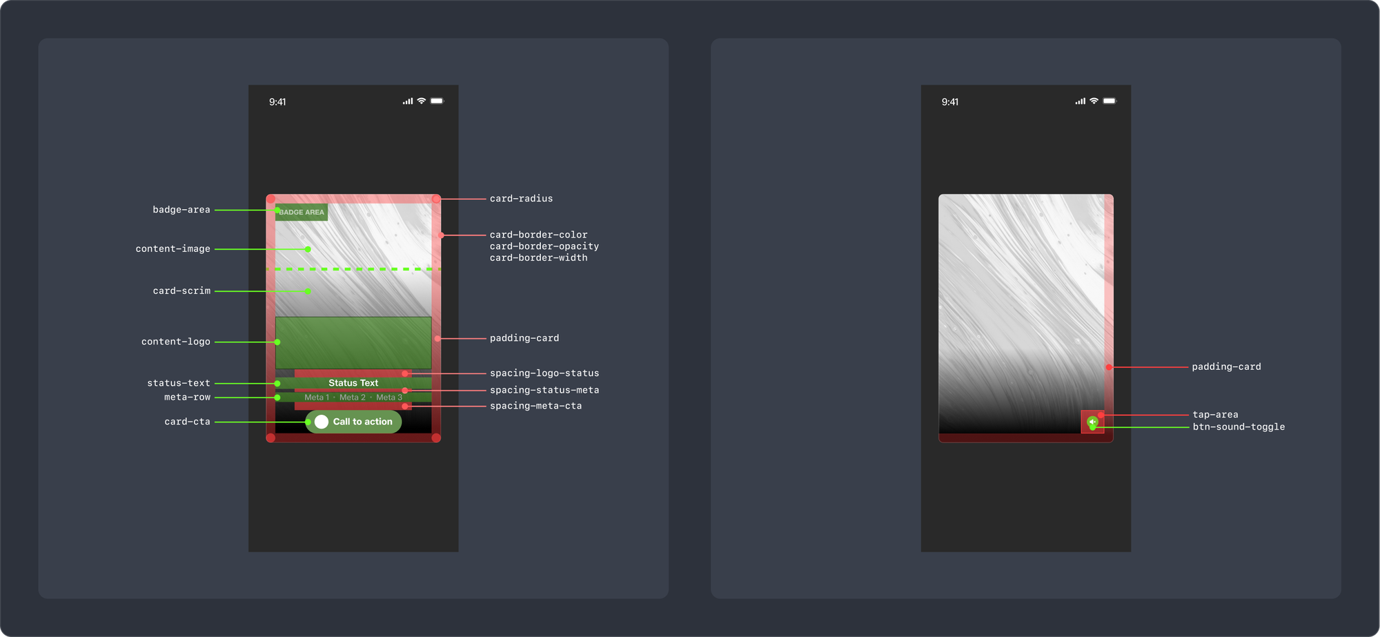
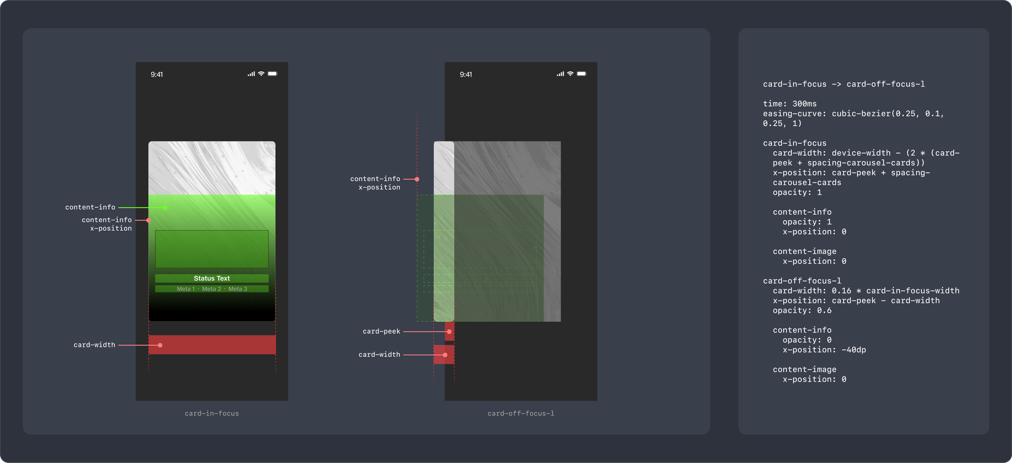
This is how we write our motion specs:
Interested in more detail? Let us know in a comment and we’ll consider writing an article about our comprehensive handoff process.
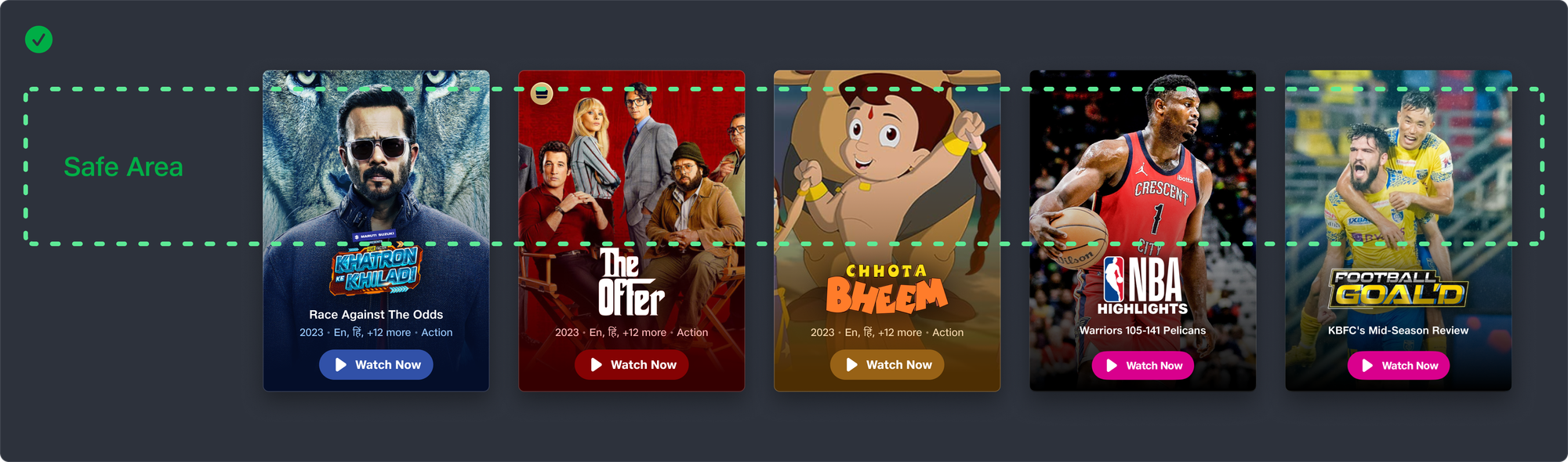
Guidelines for Publishing
We shared extensive guidelines with our publishing teams, so they were empowered to design consistent and clear artwork for the carousel.
Here are a few artefacts from the guidelines document:
Metrics impact
We always expected the carousel redesign to improve the qualitative aspect of user experience. After all, not everything needs metrics for validation. But good design must also result in some improvement in business outcomes.
We were pleasantly surprised by what we found.
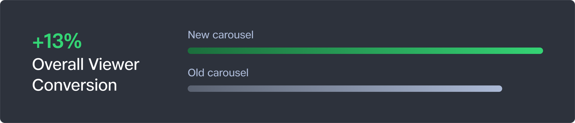
Viewer Conversion
This is our primary metric. Here's an example to understand it - if a 100 people open our app daily and 70 watch something, our Viewer Conversion is 70%.
The new carousel improved our Viewer Conversion by 13%
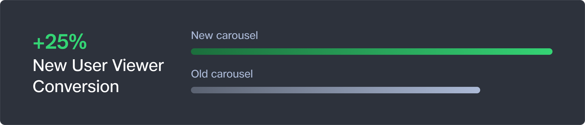
New User Viewer Conversion
If we track Viewer Conversion for new users only, that's New User Viewer Conversion.
New User Viewer Conversion improved by 25%
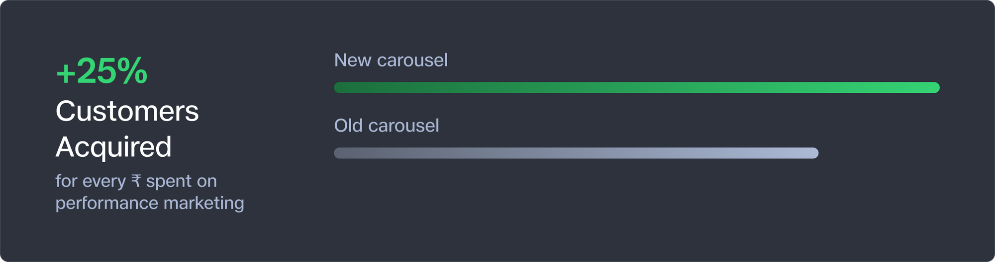
Marketing efficiency
These metrics directly improved our marketing efficiency. Our performance marketing teams could now choose to either...
- acquire ~25% more new customers at the same spends, or
- spend ~20% less to acquire the same number of new customers as planned.
Good design is also good business!
Conclusion
The carousel redesign project was a labour of love from a diverse set of stakeholders - product designers, front-end engineers, backend engineers, QA engineers, product managers, graphic designers, and executives. We couldn't be happier with the result, and hope you enjoy using it as much as we enjoyed making it.
We love working with folks passionate about building amazing customer experiences. We're hiring! Check out openings here.